Create a Dashboard in People Analytics
People Analytics Dashboards
People Analytics dashboards enable you to view detailed insights about specific data, helping you explore data, monitor activities or events, identify patterns, and discover relationships.
- Tabbed – Organizes your visualizations on individual tabs.
- Infographic – Presents information using multiple visualizations on a scrolling page.
Dashboard Visualizations
People Analytics dashboards enable you to create visualizations to illustrate trends, comparisons, and relationships in your data. Several different types of visualizations are available, including pie charts, bar graphs, and tables. You can select a specific visualization for your data, or you can allow People Analytics to automatically select the appropriate visualization for your data type.
You can add the following visualizations to a dashboard:
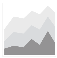
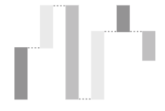
- Area
- Displays an area chart that enables you to view the magnitude of change over time. An area visualization is similar to a line chart, but the results for each column display in a stack, and the areas below each line are filled with colors or patterns.
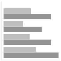
- Bar
- Displays a horizontal bar chart that enables you to compare data or show trends over time.
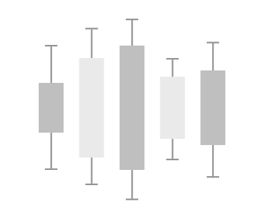
- Box Plot
- Displays a box plot that enables you to to identify outliers and compare distributions. Box plots show the mean quartiles, median quartiles, and outliers for a variable. Each box has extending lines that connect to a data point and provide additional information about the spread of data. The empty circles (O) are the outliers in the data.
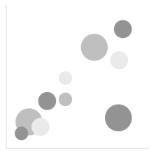
- Bubble
- Plots your numeric data on a scale to enable you to view relationships. The bubble visualization uses three measures to display data: the x-axis, the y-axis, and the size of each bubble.
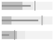
- Bullet
- Displays a bullet chart that enables you to compare measures against a target value.Note The drill-through feature is not available for bullet visualizations.
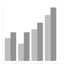
- Column
- Displays a vertical bar chart that enables you to compare data or show trends over time.
- Crosstab
- Displays a crosstab that enables you to view relationships between three or more columns. For more information about crosstabs, refer to the Create a Crosstab Report in People Analytics job aid in the UKG Community™ Library.
- Data player
- Displays a video player that enables you to animate all visualizations on your dashboard to view the impact of a specified data item. Select the Play icon to play an animation that filters all visualizations by each value of the specified data item.

- Decision tree
- Displays a connected hierarchy of boxes. Each box represents a group of records, and each branch corresponds to a decision rule. Decision rules predict outcomes in the target field. To view a decision rule, select the Expand icon to expand the decision tree, and then select the Rules tab.Note Filters are not supported for decision tree visualizations.

- Drop-Down List
- Displays a drop-down list that enables users to quickly filter other visualizations on the same tab by the selected values. You can use the visualization's properties to enable single-select or multi-select mode.

- Driver analysis
- Displays the key drivers, or predictors, for a target. The drivers are listed in order of weakest to strongest, with the weakest drivers on the left and the strongest drivers on the right.Note Filters are not supported for driver analysis visualizations.

- Heat map
- Displays a matrix type heat map that enables you to view the relationship between columns. The relationship between two columns is indicated by their color and the intensity of their color.

- Hierarchy bubble
- Displays a bubble chart with nested bubbles that enable you to view relationships for a large amount of data in a small space. This visualization is similar to the bubble visualization, but uses nested bubbles that represent a hierarchy.

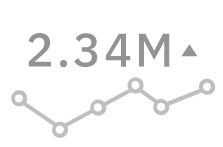
- KPI
- Displays a key performance indicator (KPI) that includes two related measures and an optional sparkline.
- Legacy map
- Displays a map that enables you to view patterns in your data by geography. You can use a legacy map when you are not connected to the internet.

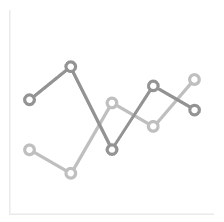
- Line
- Displays a line chart that enables you to view trends over time.
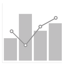
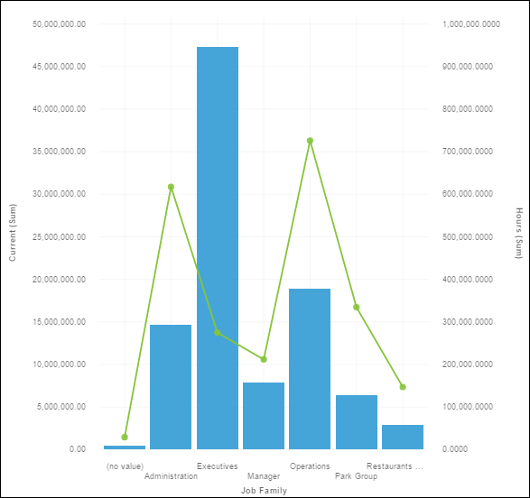
- Line and column
- Displays a line chart and a vertical bar chart, enabling you to view relationships between multiple sets of data.
- List
- Displays a list that provides a hierarchical view of your data.

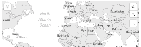
- Map
- Displays a map that enables you to view patterns in your data by geography.
- Marimekko
- Displays your data in columns of varying widths that contain bars of varying heights. A marimekko visualization is similar to a stacked column visualization. The width of a column is based on the value of the data assigned to the width field. The height of each bar is a percentage of the column's total value.
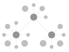
- Network
- Displays your data in circular nodes that are connected together with lines. This enables you to view connections, networks, and points of intersection in your data.
- Packed bubble
- Displays a packed bubble chart that enables you to view relationships for a large amount of data in a small space. This visualization is similar to the bubble visualization, but does not plot the bubbles over a grid.

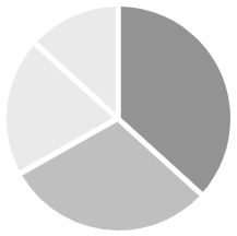
- Pie
- Displays a pie chart that categorizes your numerical data into slices, enabling you to view each slice as a percentage of a whole.
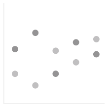
- Point
- Plots your data vertically to enable you to view trends over time. A point visualization is similar to a line chart, but doesn't use lines to connect points.
- Radar
- Shows which variables have similar or outlier values and which variables are scoring high or low within a data set.

- Radial
- Displays your data in a radial bar chart that enables you to compare data. Each bar is plotted in a circular shape. Longer bars represent larger values.

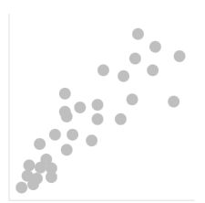
- Scatter
- Displays your data in a scatter chart that enables you to view correlations between different sets of data. Scatter visualizations use data points to plot two measures anywhere along a scale.
- Spiral
- Displays the key drivers, or predictors, for a target. Stronger drivers appear closer to the center of the spiral.Note Filters are not supported for spiral visualizations.

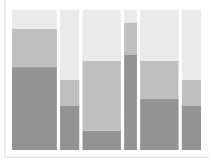
- Stacked bar
- Displays your data in a stacked bar chart that enables you to compare the proportional total of each horizontal bar in a stack.
- Stacked column
- Displays your data in a stacked bar chart that enables you to compare the proportional total of each vertical column in a stack.
- Summary
- Displays the total or count of a data item.
- Sunburst
- Displays decision tree nodes in a sunburst chart to enable you to view how underlying data predicts a target. Decision rules predict outcomes in the target field. To view a decision rule, select the Expand icon to expand the sunburst, and then select the Rules tab.

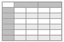
- Table
- Displays detailed information in rows and columns. Each column contains the values of a data item or a calculation based on your data.
- Treemap
- Displays large sets of hierarchical data in a treemap that enables you to view patterns and exceptions.Note The treemap visualization does not display negative numbers.

- Waterfall
- Displays your data in a waterfall chart that enables you to view the cumulative effect of positive and negative values on an initial value. The bars in a waterfall visualization are not totals. The initial value in a waterfall visualization is increased and decreased by a series of time-based or category-based intermediate values, leading to a final cumulative value in the far right column.
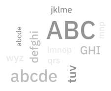
- Word cloud
- Displays a text-based visualization of a column. The text height represents the scale.
People Analytics Dashboard Access
To create dashboards users must be assigned to the Analytics User, Author, or Reporting Administrator role.
Create a Dashboard in People Analytics
Use People Analytics dashboards to monitor events and activities at a glance, and make informed decisions about your strategic initiatives.
- Add a dashboard visualization, using one of the following methods:
- If you know the type of visualization you want to use, select the Visualizations tab, and then select the type of visualization.
- If you know the data that you want to view, but are not sure how to present it, drag and drop the
data item onto the work area. People Analytics automatically displays the data item in the
appropriate visualization.Note If you want to select a different visualization type, from the on-demand toolbar, select the Change Visualization icon, and then select a new visualization.
Note To maximize a visualization in a square, drag a visualization or data item over the center of the square, and then drop the item over the Drop Here to Maximize icon.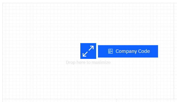
- To add data to a visualization, select the visualization from the work area, and then drag and drop data items from the Sources tab to the appropriate drop zones in the Fields pane. Ensure that you add a data item to the drop zone for each required field. Required fields are indicated by asterisks (*).Note You can locate data items to add to the dashboard by navigating through the folder structure or by using the search function. If you know where a data item is located, expand the package folders and query subjects to retrieve the data item. If you are unsure of the data item location, you can enter a term in the Search field above the package folders.When all required data items are added, People Analytics renders the visualization.
Modify a Visualization
Edit a visualization to select new colors, modify titles, add or remove data, change the type of visualization, or modify additional properties.
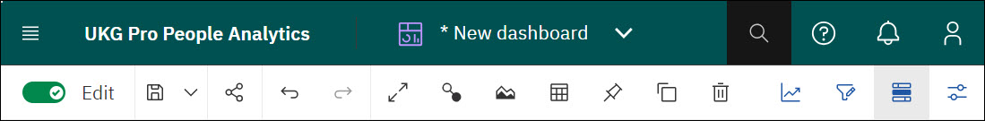
- From the dashboard toolbar, turn the Edit toggle on.
Repeat a Column or Row
Some visualizations, such as an Area visualization, allow you to repeat the visualization to view data by a specified row or column. For example, you might want to view your data by year. You can add a Year data item (or calculation) to the Repeat (Column) slot or Repeat (Row) slot to replace a single visualization with a visualization for each year.
- From the UKG Pro® People Analytics portal, open the dashboard.
- From the People Analytics application bar, select the Open Menu icon.
- From the Open Menu, select Content.
- From the Content page, select a tab, and then navigate to the location of the dashboard.
- Select the Action Menu icon for the dashboard.
- Select Open.
- From the dashboard toolbar, turn the Edit toggle on.
- From the dashboard canvas, select the visualization you want to repeat.
- From the Source pane, drag and drop a data item to one of the following slots in the Fields pane:
Option Description Repeat (Column) Repeats the visualization in multiple columns. Repeat (Row) Repeats the visualization in multiple rows. - (Optional) Specify whether chart iterations for each value of the repeated row or column appear one at a time:
- (Optional) To sort the repeated visualizations, select the More (vertical ellipsis) icon beside the repeated data item, select Sort, and then select an option. The following sort options are available:
- Sort ascending
- Sort descending
- Auto
- Custom
- (Optional) To filter the repeated visualizations, select the More (vertical ellipsis) icon beside the repeated data item, select Filter, and then select values or add a filter condition.
- Select Save.
Modify Dashboard Tabs
The Tabbed dashboard type enables you to organize your visualization on individual tabs. Use the on-demand toolbar to modify dashboard tabs.
- From the UKG Pro® People Analytics portal, open the dashboard.
- From the People Analytics application bar, select the Open Menu icon.
- From the Open Menu, select Content.
- From the Content page, select a tab, and then navigate to the location of the dashboard.
- Select the Action Menu icon for the dashboard.
- Select Open.
- From the dashboard toolbar, turn the Edit toggle on.
- Select a dashboard tab to view the on-demand toolbar.
- (Optional) To edit the title of a tab, from the on-demand toolbar, select the Edit the Title icon, and then enter a descriptive name for the tab.
- (Optional) To copy a tab, from the on-demand toolbar, select the Duplicate icon.
- (Optional) To change the template of a tab, from the on-demand toolbar, select the Change Template icon, and then select a new template from the Select a Template dialog box.
- (Optional) To change the background color of a tab, with no visualizations selected, select the Properties icon, go to , and then select a new color.
- Select Save.
© 2024 UKG Inc. All rights reserved. For a full list of UKG trademarks, visit https://www.ukg.com/trademarks. All other trademarks, if any, are the property of their respective owners.
This document and all information contained herein are provided to you "AS IS" and UKG Inc. and its affiliates (collectively "UKG") make no representation or warranties with respect to the accuracy, reliability, or completeness of this document, and UKG specifically disclaims all warranties, including, but not limited to, implied warranties of merchantability and fitness for a particular purpose. The information in this document is subject to change without notice. The document and its content are confidential information of UKG and may not be disseminated to any third party. No part of this document or its content may be reproduced in any form or by any means or stored in a database or retrieval system without the prior written authorization of UKG. Nothing herein constitutes legal, tax, or other professional advice. All legal, tax, or other questions or concerns should be directed to your legal counsel, tax consultant, or other professional advisor. All company, organization, person, and event references are fictional. Any resemblance to actual companies, organizations, persons, and events is entirely coincidental.